REIMAGINING HEALTHCARE
ART DIRECTION AND DESIGN
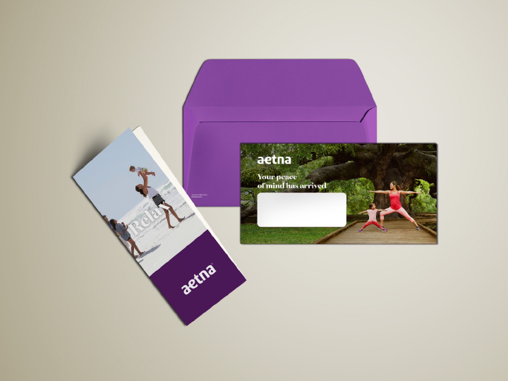
In launching a new regional product, we had the opportunity to revisit our members’ experience. We took a step back and explored the user experience at each touchpoint of exploring quotes online to receiving your product and card to using your member card at the doctor’s office to logging into your member portal online. We have ensured our member was the primary user, and the provider the second in this resign. We wanted the materials alongside the card to drive our mission to reimagine healthcare and simplify the member’s experience. We’ve redesigned member cards, direct mail pieces, our websites for the member portal and quotes tool, and a mobile app version of the member portal.

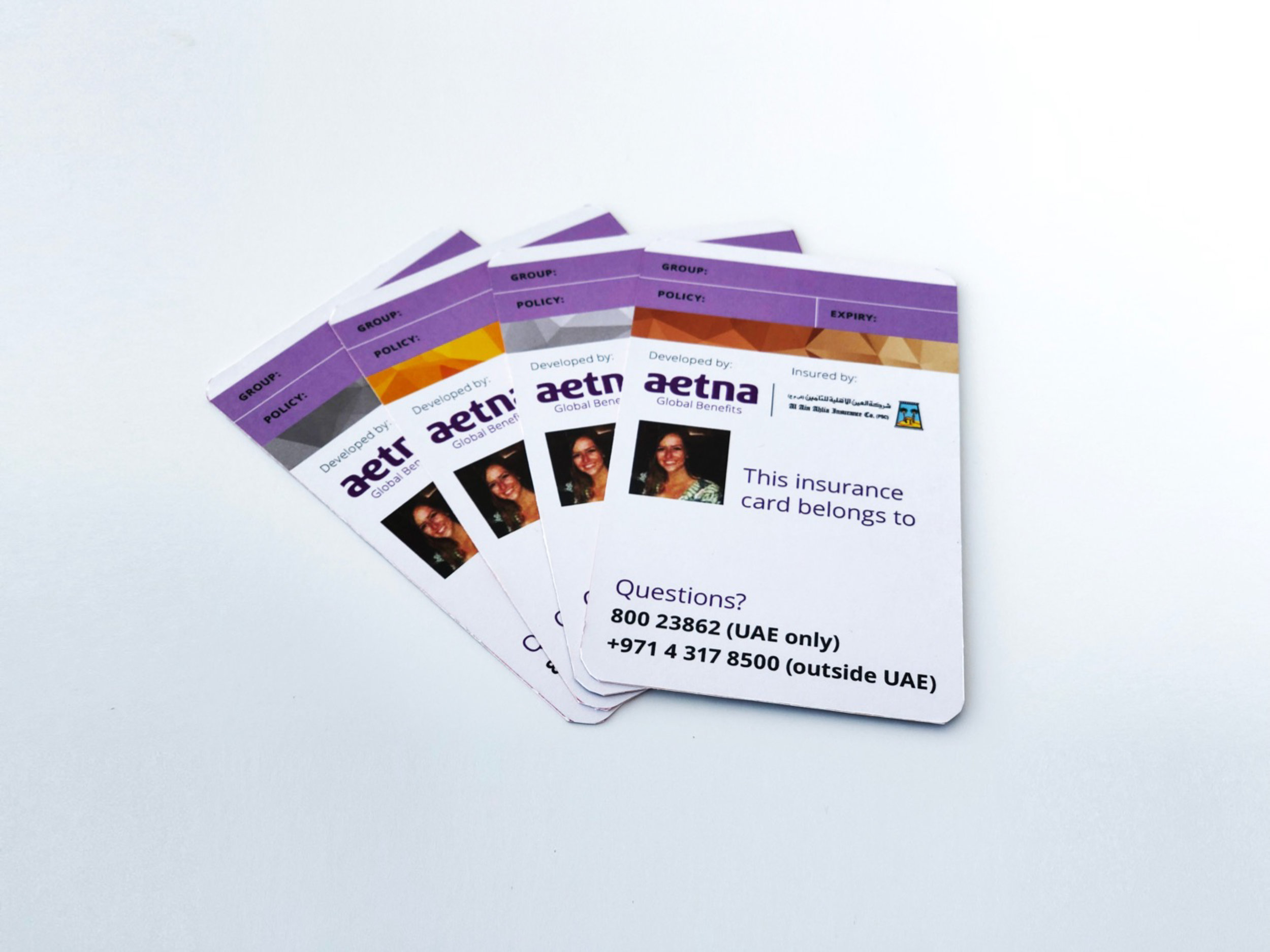
Tier system
In a region where the cultural landscape is so diverse and native languages vary, we ensured easy visual distinction between plan tiers in the metallic band across each card representing the tier plan the member is a part of. Additionally, our design incorporates member photo for certain regions.

member vs provider
Inspired by the Universal Card Template, we visually separated the provider information from the member information, giving the member information the most prominence and ease of use. Our brand voice was incorporated through the member information to be approachable and familiar.